Turning a neglected finance module into a new revenue driver
A full redesign of a module used by less than 10% of customers — rebuilding user trust and unlocking the company's expansion into new financial services.
Read the full case study



Senior Product Designer with a sharp eye for product strategy and business impact.
A full redesign of a module used by less than 10% of customers — rebuilding user trust and unlocking the company's expansion into new financial services.
Read the full case studyA ground-up reorganization of a design system built over three years, cutting down inconsistencies and laying a scalable foundation for both Design and Engineering teams.
Read the full case studyThe project that reshaped my startup's product direction — moving from cold-email automation to a more profitable commercial intelligence platform.
Read the full case study
A UX designer with a product mindset, startup grit, and real B2B experience.
I've always been "the design guy" — it started with designing t-shirts for class events back in high school. That instinct followed me to college, where I discovered UX and never looked back. It's been 8+ years since then. Along the way, I earned a Computer Science degree from the University of Brasília (UnB), co-founded two companies, worked at a startup, and helped shape more than 30 digital products.
My approach is data-driven by nature. I like tying design decisions directly to company strategy and business goals — tracking usage metrics, talking to real users, and stress-testing ideas with stakeholders before pushing for big product changes.
I'm easy to talk to and genuinely curious about almost everything. Outside of work, you'll find me making music, volunteering, oil painting, boxing, or deep in a tabletop RPG session.
How I led the full redesign of a module used by less than 10% of customers — rebuilding user trust and clearing the path for the company's financial-services expansion strategy.
⚠️ Due to an NDA, this case study doesn't include images of the interface redesign.
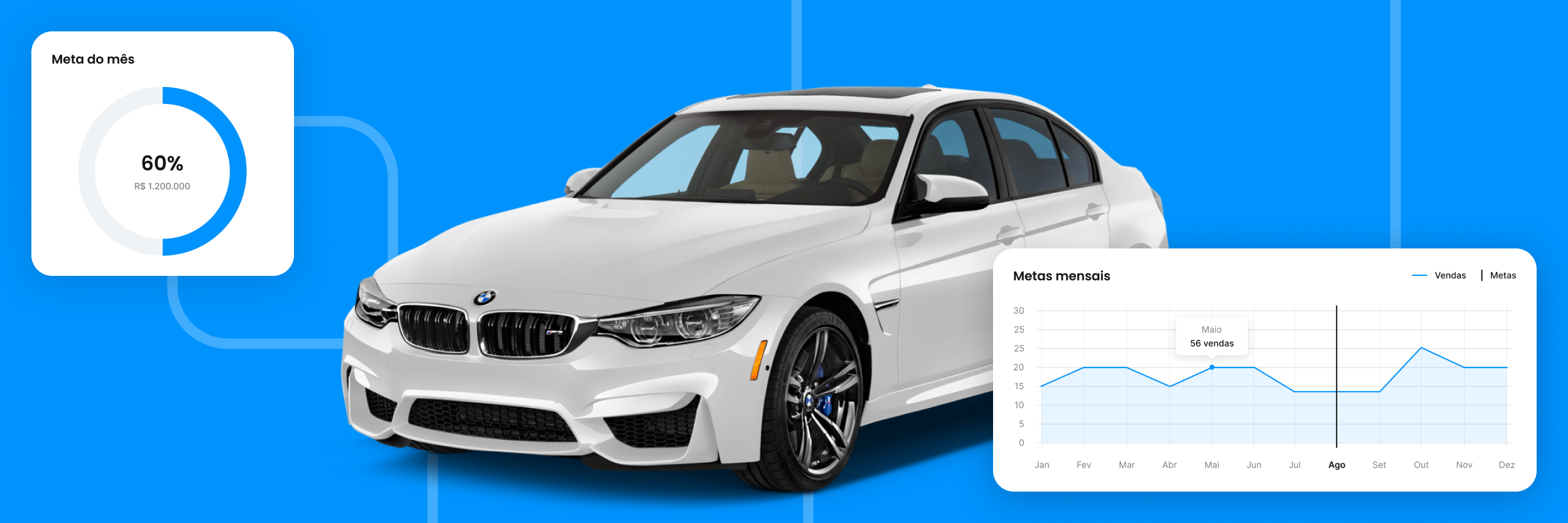
The redesign drove a significant jump in customer usage of the finance module and became a key piece of the company's growth strategy. Higher adoption opened the door to partnership deals that monetized transactional services on the platform, creating new revenue streams.
Ecosys AUTO is a B2B SaaS platform for managing auto dealerships. Growing revenue through financial integrations was one of the company's key strategic goals for 2025 — and that plan hinged directly on the platform's finance module. There was just one problem: Customer Success found that fewer than 10% of customers were actually using it. Users described the module as confusing, unreliable, and out of step with how they actually managed their finances.
I was the sole Product Designer on this project, owning it end to end — from Discovery to Delivery: structuring the research, defining the solution strategy, designing the new experience, and following through implementation all the way to launch.
I worked closely with the CTO, Product Owner, Tech Lead, Engineering, and Customer Success to align business needs, user expectations, and technical constraints — helping steer decisions throughout the project.
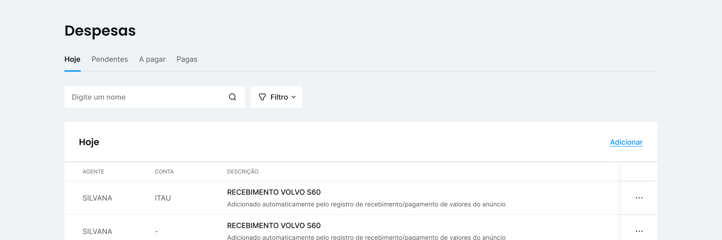
Early feedback from the CS team pointed to the module being "confusing," but it wasn't clear yet what was actually blocking adoption. To dig deeper, I interviewed three finance leads at dealerships to understand how they ran their operations, what tools they relied on, and where the platform was falling short.
Business-rule errors that miscalculated receivables and taxes.
Logic that didn't match competitor tools, which frustrated users trying to find features.
Customers running highly informal operations with no financial tracking at all.
No way to migrate or import records from before they signed up.
To validate what I was seeing, I interviewed two automotive-industry specialists and ran a competitive benchmark, which confirmed our hypotheses and clarified which behaviors were already standard in the market. I wrapped it all up in a report covering the key hypotheses, an Impact × Effort roadmap, and the metrics we'd track going forward.
The research made it clear that quick, surface-level fixes wouldn't cut it — most of the friction was baked into the system's logic and called for deeper changes. A full redesign meant expanding the original scope and negotiating more development time in an environment that was pushing for fast turnarounds.
The evidence from Discovery gave me the confidence to make the case for that investment and get Product, Engineering, and leadership aligned around a solution that tackled root causes instead of just patching symptoms.
With scope locked in, I started prototyping different ways to organize complex financial information. I used low-fidelity wireframes to test navigation, visual hierarchy, and data organization before moving into high-fidelity prototypes in Figma.
Along the way, I hit a wall in the company's Design System — the existing components couldn't handle the finance module's needs, and reusing them would have hurt consistency. After aligning with Product and Engineering, we decided to extend the Design System before implementation, adding new components built specifically for this context.
While I refined the interface, I worked in parallel with the Tech Lead to revisit the business rules flagged during Discovery, letting Design and Development move forward at the same time. The final solution included four core financial-management screens, dynamic filters, simplified transaction forms, inventory and invoice integration, data import/export, and a full overhaul of the business rules.
In the months after launch, the CS team ran a strong push to promote the new module, and usage jumped accordingly. User interest matched expectations, with strong feedback that the solution finally fit how customers actually worked.
Beyond improving the day-to-day experience, this project removed one of the biggest obstacles to the company's plan for expanding transactional services. By rebuilding customer trust, the solution laid a stronger foundation for integrations like fine-installment tools, credit access, and card-reader sales.
New priorities came up shortly after launch, so I wasn't able to track these metrics over a longer stretch. Still, I followed the product through its first months in production and confirmed the original goals were being met.
How I reorganized a component library built over three years of product evolution — cutting down inconsistencies and building a scalable foundation for Design and Engineering.
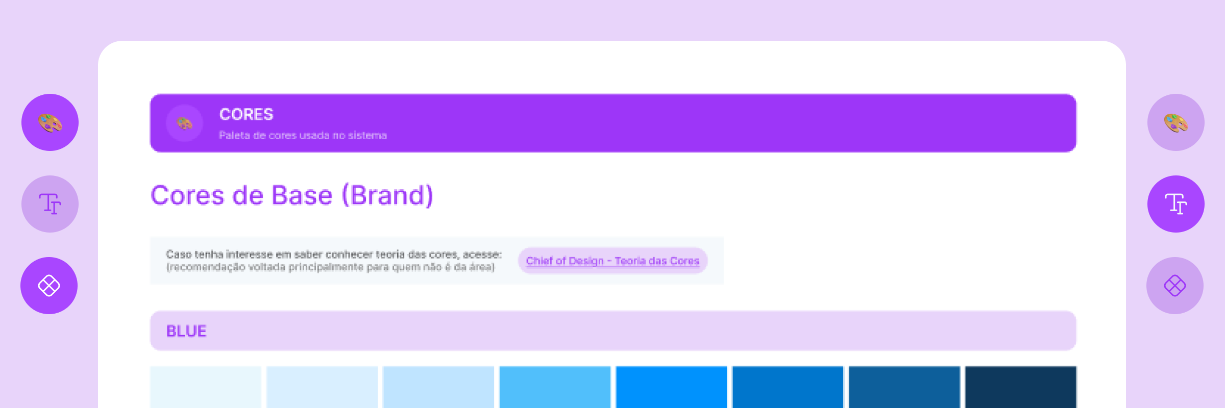
Over three years, the product evolved fast and passed through the hands of several different Design and Development teams. That pace helped validate the business, but it also piled up inconsistencies that made the product harder and harder to build on — every new feature took more effort, since there was no reliable library or consolidated standards to lean on.
The reorganization gave Design and Engineering a shared foundation to build on, letting new features ship on consistent standards and cutting down the effort needed to evolve the interface.
average increase in sprint delivery capacity over the period, based on metrics tracked by the Product Owner. The result reflects several factors, but standardization made a clear difference in how quickly new interfaces could ship.
Ecosys AUTO started out as custom software built for a single dealership. As the business grew, the product was adapted into a SaaS model and scaled quickly. Along the way, different teams shaped the interface — first developers, then an outsourced dev shop, and later another Product Designer. What they left behind was a fragmented interface with conflicting standards and a library that could no longer keep up with the platform's complexity.
This was the first project I took on after joining the company. I audited the existing interface, built a library of reusable components, and set the standards that let Design and Engineering build on the same foundation going forward.
Beyond the initial cleanup, I set the criteria for how the library would keep evolving and acted as the go-between for Product, Engineering, and QA — aligning standards, processes, and decisions so the library became a real part of the team's development workflow.
The first step was a full audit of the live product and the design files. Going screen by screen, I mapped out components that looked similar but behaved differently — prime candidates for unification — along with others that had drifted from the color, typography, or spacing standards.
I also audited the existing Figma library to flag redundant variants, naming inconsistencies, and chances to consolidate. The key call I had to make here was balancing visual consistency with technical feasibility — favoring components close to what Engineering already had in place whenever that didn't compromise the experience.
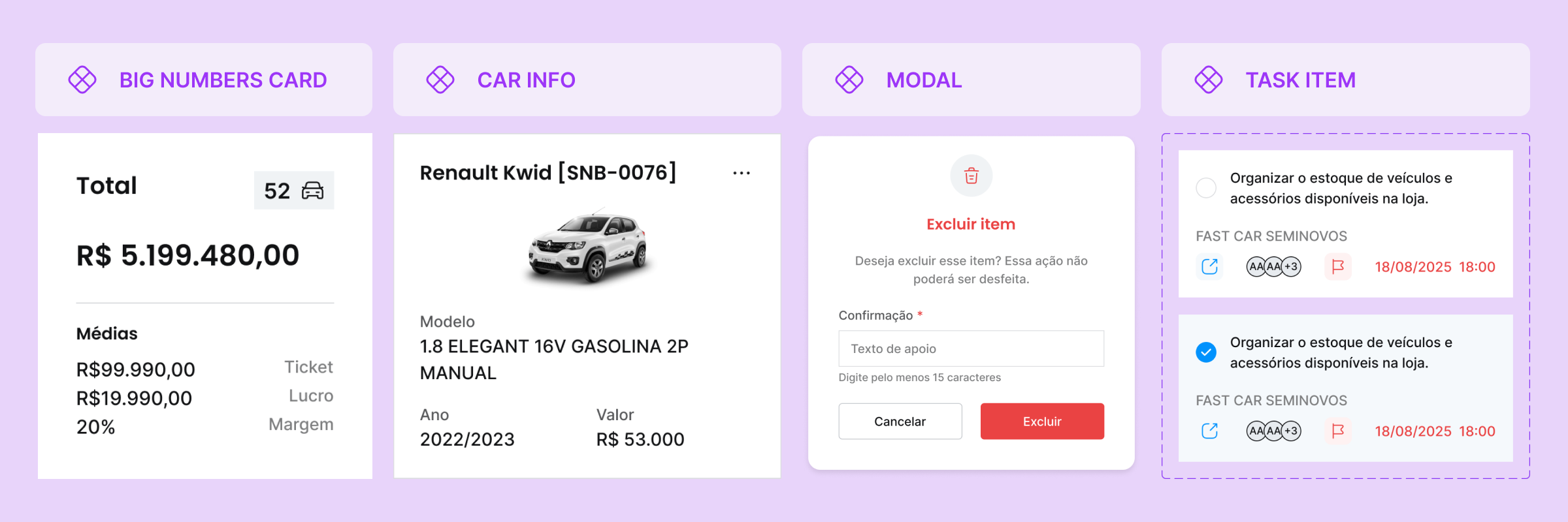
The visual standards already existed on the most important screens, but they hadn't carried over to screens built later on. Fixing that meant defining fixed variables and rolling them out consistently. I used the opportunity to expand the color palette and typographic hierarchy, adding variations that were likely to be needed as the product grew — planning ahead that saved us from structural rework with every new feature.
Next, I organized the components using Atomic Design principles, starting with the simplest elements and building more complex ones from those atoms up. That boosted reuse and made the library's growth far more consistent and predictable.
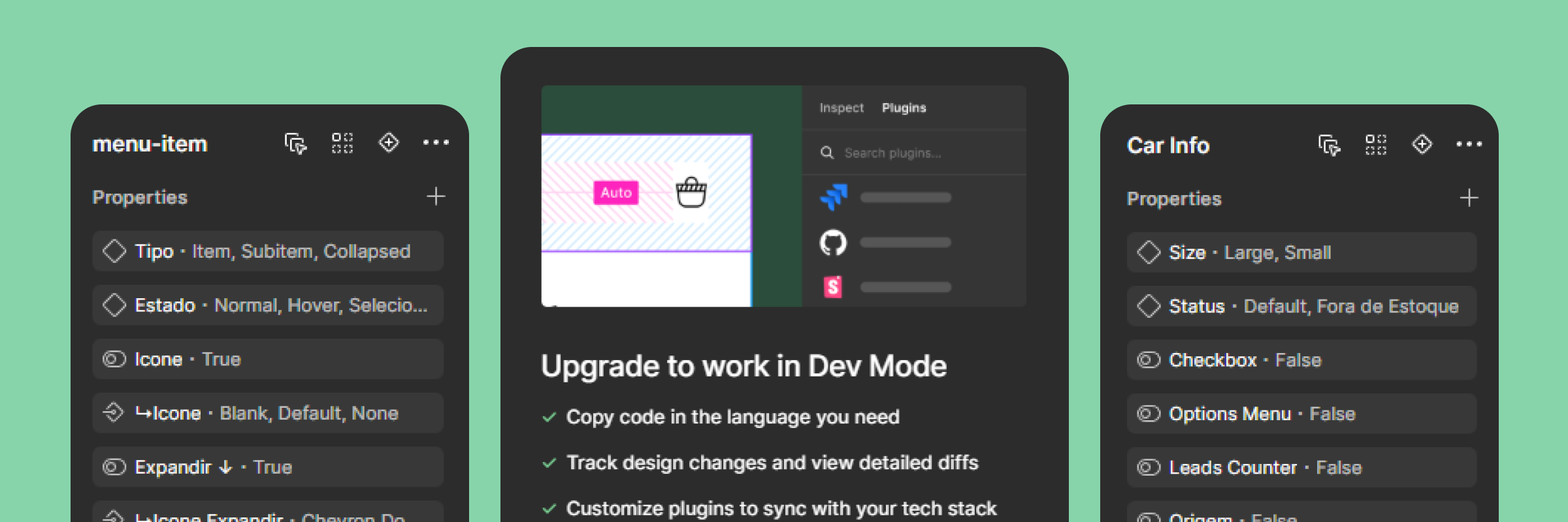
A well-organized Figma file, on its own, wasn't going to fix the problem. The real challenge was carrying that organization through into the development process — and ultimately, into the product customers actually used.
I made the case for investing in Figma Dev Mode licenses, giving Engineering direct access to CSS behavior documentation, spacing measurements, and variables — cutting down on mismatches between design and implementation.
We refactored the core components following the atomic structure. Working alongside the Tech Lead, we ran workshops walking the team through the new organization and the long-term payoff of the rework.
Together with the QA analyst, we made design-to-code matching part of the release checklist, keeping visual inconsistencies from creeping back in.
That integration turned the library from a design-only resource into a shared reference point for the entire development lifecycle.
How I led the research that reshaped our product focus and drove its evolution from a cold-email platform into a commercial intelligence solution that was more profitable and better matched to what customers actually needed.
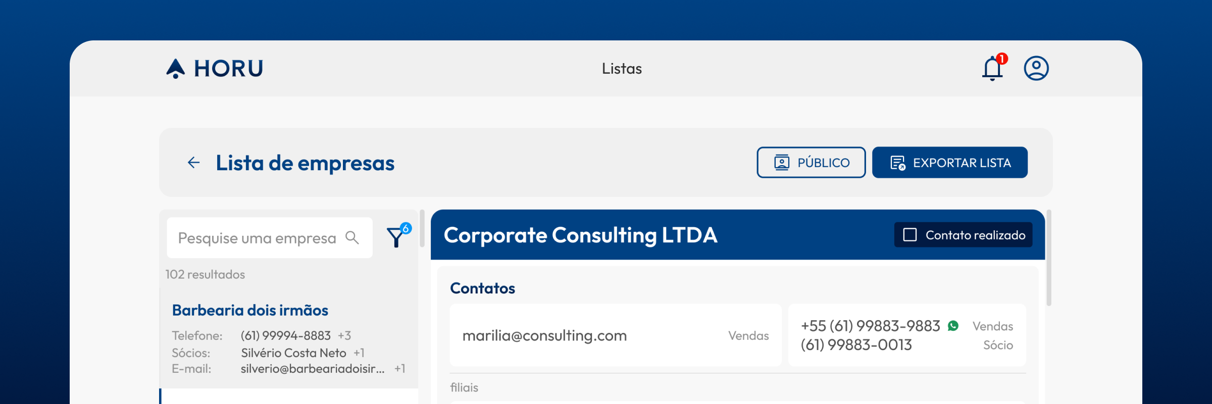
Horu started out with a simple pitch: automate B2B prospecting through AI-assisted lead generation and cold-email campaigns. Early validation went well, and we landed our first paying customers.
But results from the first few months in production showed that automation alone wasn't delivering enough to justify the investment for most customers. We needed to figure out where the idea was falling short in execution and find a viable path to actually deliver value.
The strategy shift took Horu from a cold-email automation tool to a commercial intelligence solution — one that resonated far more with companies that already had active prospecting processes in place.
estimated increase in LTV
paying customers, with strong retention and satisfaction
Horu grew out of a pain point my co-founders and I felt firsthand as owners of a software dev shop trying to scale. Between our own experience and conversations with other founders, we spotted a widespread problem: small B2B companies struggling to find prospects who actually matched their ideal customer profile.
Our first hypothesis was that cold-email campaigns would generate B2B leads more effectively than social media outreach. That pitch won over our first customers, but once we launched, usage data and close contact with them showed the idea wasn't delivering the returns we expected.
As co-founder and Head of Experience, I owned the customer experience and the product's evolution end to end. Beyond UX and UI, I ran onboarding, worked closely with Customer Success, led research and feedback sessions, and guided backlog prioritization.
I was directly involved in strategic decisions, connecting usage data, customer feedback, and business goals. During the pivot, I led the research and drove the translation of our new strategy into the platform's experience, features, and processes.
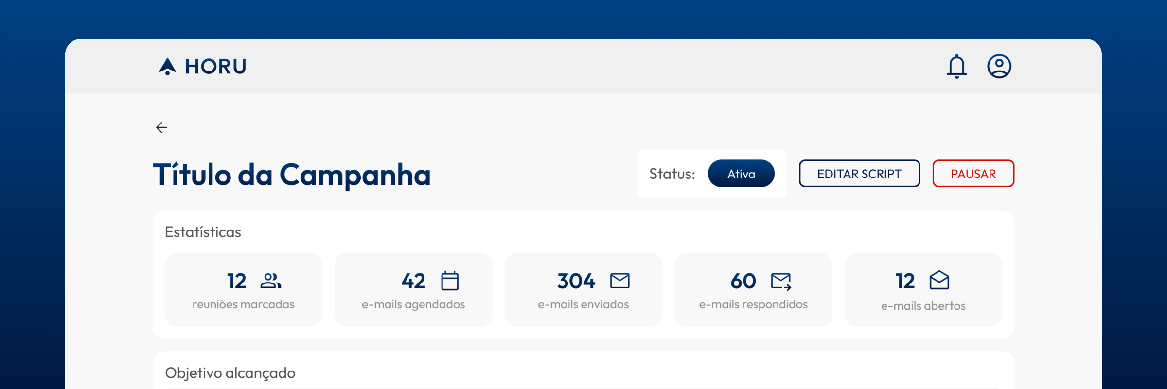
The early reports showed solid open rates, but reply rates were dismal: emails sent converted into sales meetings at a rate of just 0.2% to 0.5%. When we mapped that against each plan's lead volume, we realized many customers could burn through their entire monthly quota without booking a single meeting.
The model only made sense for high-ticket customers with a marketing team fine-tuning every send by hand — a far smaller audience than we'd planned for.
We saw it firsthand: phone-based prospecting brought in significantly higher reply and booking rates.
I backed that up with interviews and Customer Success check-ins: customers saw potential in the platform, but couldn't justify the spend given the results they were getting. That reframed the problem entirely and pointed us toward a new direction — Horu's real value wasn't in automating prospecting, it was in giving sales reps better data to work with.
Up until then, most of our engineering effort had gone into automation and email-campaign quality. We shifted our focus to commercial intelligence — expanding both the volume and quality of available data, especially phone numbers and information sales reps could use directly during prospecting.
That shift also changed who we were building for: companies with some level of sales maturity got far more value out of the platform, while customers without an established prospecting routine struggled to turn data into sales. From there, I led the effort to translate our new hypothesis into an updated version of the product, which shipped about two months after we identified the problem.
We repositioned the product to support phone-based prospecting alongside email generation, mainly by rethinking how we collected, enriched, and presented data. We built a new search engine focused on phone data and expanded what we captured for each company, including LinkedIn profiles and information on key decision-makers.
We also built AI SDR, which analyzed the collected data and generated a commercial summary for each company, helping reps identify relevant talking points before reaching out. Alongside these changes, I redesigned the company-listing experience so reps could run their entire prospecting workflow directly in the platform or export it straight to their CRM.
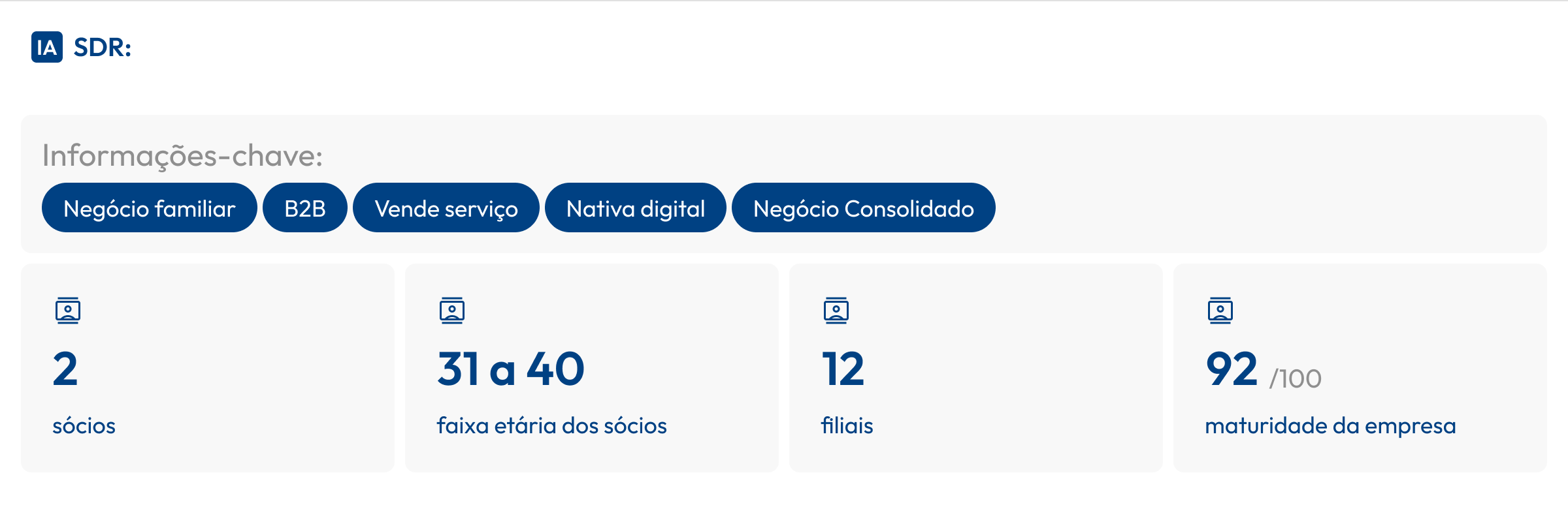
The new approach lined up much better with how customers actually prospected. Instead of leaning on fully automated campaigns, Horu started directly supporting sales reps' day-to-day work — arming them with the data and context to make every outreach more qualified.
Through this, we got a clear picture of the customer profile that got the most value from the platform: companies with a structured prospecting routine and dedicated sales staff.